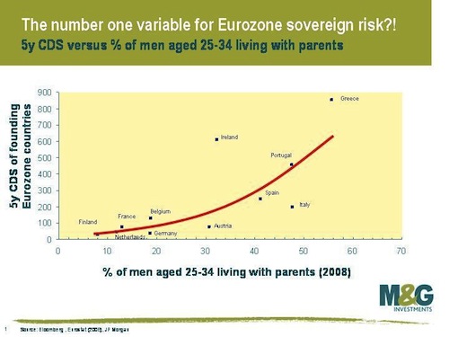
Even if the graphs are, oh, maybe just a little misleading. Take this one, for example. It appears to say that the reason certain European countries are in worse financial shape than others is because more of their men want to stay at home playing videogames.
See? Italy, Greece, Spain, and Portugal are over there on the right, with more of their menfolk living with the parents. And, conveniently, those same countries rank high on the riskiness (a.k.a. sovereign risk) of their government bonds (a.k.a. sovereign debt).
If he lives with his parents, you might want to think twice. About buying his government’s debt. (via The Economist)
But in case your statistics teacher hasn’t drilled this into your heads yet, correlation is not causation. This is a real-world example of that. Just because you can make a chart with a nice line on it doesn’t necessarily mean that one factor causes the other. Think about this:
- The % of men living with their parents may be another way of describing the % of men who are unemployed (or underemployed). That would certainly be a factor in a country’s financial health.
- Adult kids living with their folks might be due to a really expensive housing market, which is another factor in a country’s financial situation.
- The countries with the highest % of men living with their parents all have cultural traditions that encourage kids to stay with their parents until they marry, or sometimes even after.
- Ireland doesn’t have this culture of stay-at-home-til-you’re-40, but their bonds are still considered risky investments. If you just focus on the red line, you might miss this important point.
In conclusion:
- Correlation is not causation
- Think before you reblog
- If you can’t do either of those things, at least read the comments
